Search
Close this search box.

Escuela de Patchwork: elección de la tela. Color. I / Patchwork School: choosing fabrics. Color. I

 
Para elegir las telas que vamos a usar en un trabajo de patchwork además de sus características (de las que hablamos aquí) tenemos que considerar la combinación de colores.


To choose the fabrics that we are going to use in a patchwork project, besides its characteristics (about which we talked here) we must consider the combination of colors.
 
El punto de partida para trabajar los colores es la rueda cromática:


The starting point to work with the colors is the color wheel: 
 

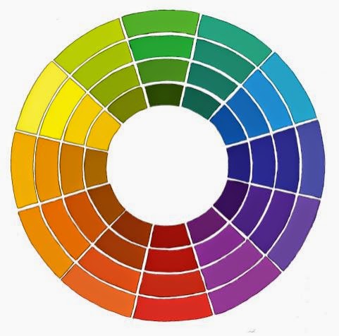
Los colores primarios son el magenta, el amarillo y el azul cian, a partir de los cuales se forman los demás. Si mezclamos colores primarios a partes iguales obtenemos los secundarios: naranja, verde y violeta. Los colores terciarios, que aparecen entre los primarios y los secundarios en la rueda, se obtienen mezclando colores secundarios. Los colores primarios imprimen mucha vitalidad a la labor y los colores terciarios en cambio transmiten un efecto más sutil.

The primary colors are magenta, yellow and cyan, from which the others are obtained. If we mix primary colors in equal proportions we obtain the secondary ones: orange, green and violet. The tertiary colors, which appear between the primary and the secondary on the wheel, are obtained mixing secondary colors. Primary colors impose a lot of vitality on the needlecraft and tertiary colors on the other hand transmit a more subtle effect.


Los colores complementarios son los que aparecen enfrentados en la rueda. Las combinaciones cromáticas más “seguras” son las formadas por tres colores adyacentes y uno complementario, que aporta contraste.

The complementary colors are those placed opposite on the wheel. The “safest” color combinations are those of three adjacent colors and a complementary one which brings contrast. 


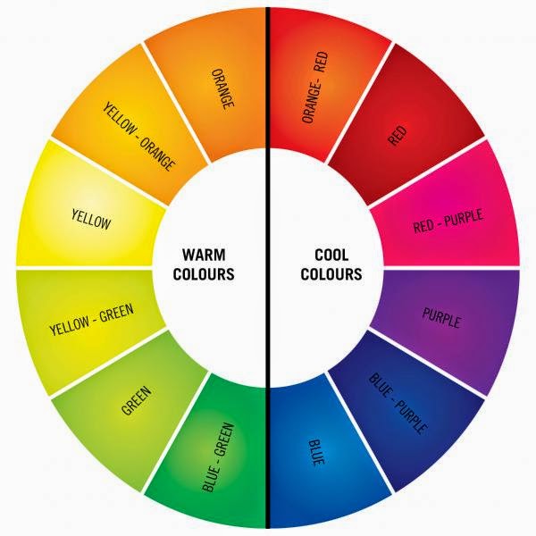
Los colores cálidos son los que se asocian con el fuego y los fríos los asociados con el agua.  Alternando colores cálidos y fríos se crea un efecto más llamativo. También existen los colores neutros, que no aparecen en la rueda cromática. Son el negro, el gris, el blanco y algunos beiges y marrones. No son colores dominantes y se pueden mezclar o intercalar entre ellos. Se utilizan a menudo como fondo.

The warm colors are those associated with the fire and the cold colors with the water. The alternation between warm and cold colors produces a more striking effect. There are also neutral colors, which do not appear on the color wheel. They are the black, grey, white and some beiges and browns. They are not dominant colors and can be mixed or placed among them. They are often used as background. 


En principio, podemos conseguir armonía de tres formas:

  • Utilizando colores adyacentes o similares.
  • Utilizando colores complementarios.
  • Utilizando colores de la naturaleza.


In principle, we can obtain harmony in three ways:
  • Using adjacent or similar color.
  • Using complementary colors.
  • Using colors of nature.


Un comentario